
The Navigation and Logo
The ITProTV ProPortal, in its original state from the start of the project. It was constrained within the middle 3/5 of the page and the navigation was thrust into the middle of the content, where these days nobody looks for navigation.
The first step was to implement the side navigation style we use on ITProTV’s other web application. The idea was to move the main navigation of the site out from the middle of the page where it is hard to find and not easily accessible. The mockup above was more or less copy pasted from the base design elements of the side navigation from the other app, then updated to have the proper color scheme and icons for the nav items.
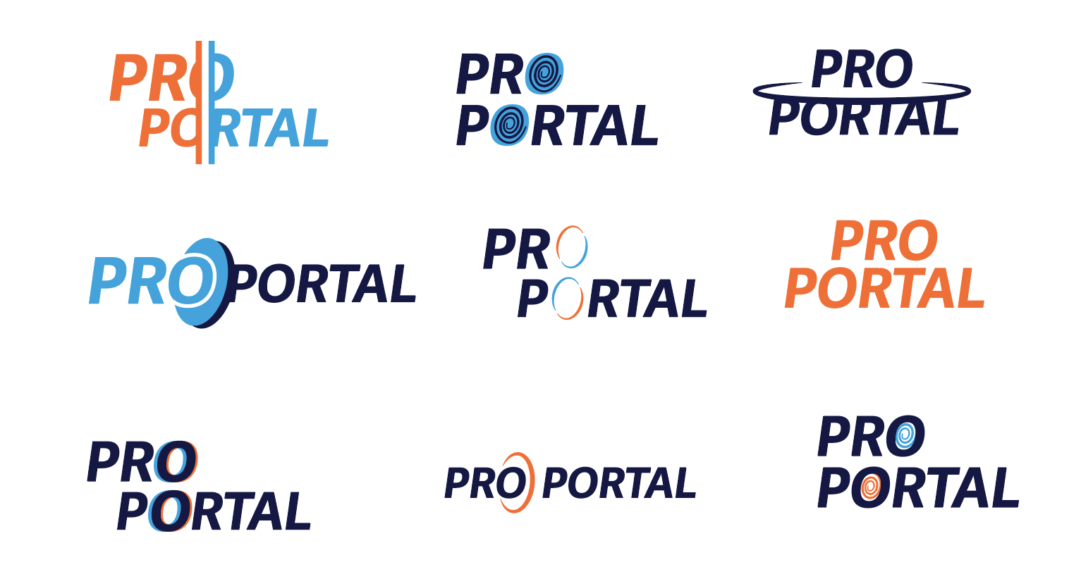
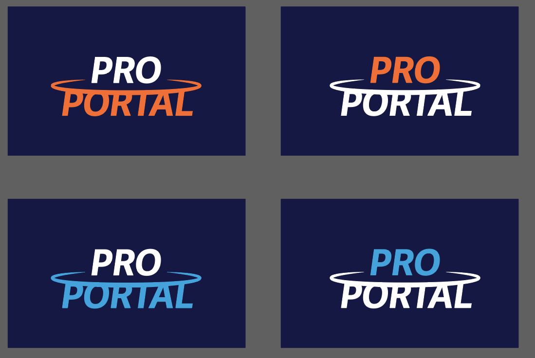
Now, being a designer at heart, it was time for me to start on a new and improved ProPortal logo. I created these iterations (left-hand image) and brought them to the team, where the stacked logo was chosen as the design to proceed with. I then worked through some color iterations and ideas (right-hand image) with the “T” being cut out and ended up with the below final design.

The final logo design.
Once the side navigation was solidifed and I had popped the new logo in, it was time to move on to the top navigation. The top navigation’s primary purpose was to let the user know which product they are using. The interactive elements on the top nav were primarily for internal usage, for which we conducted a user test with internal employees. We didn’t find any snags in the experience and thus proceeded to creating the dashboard view.
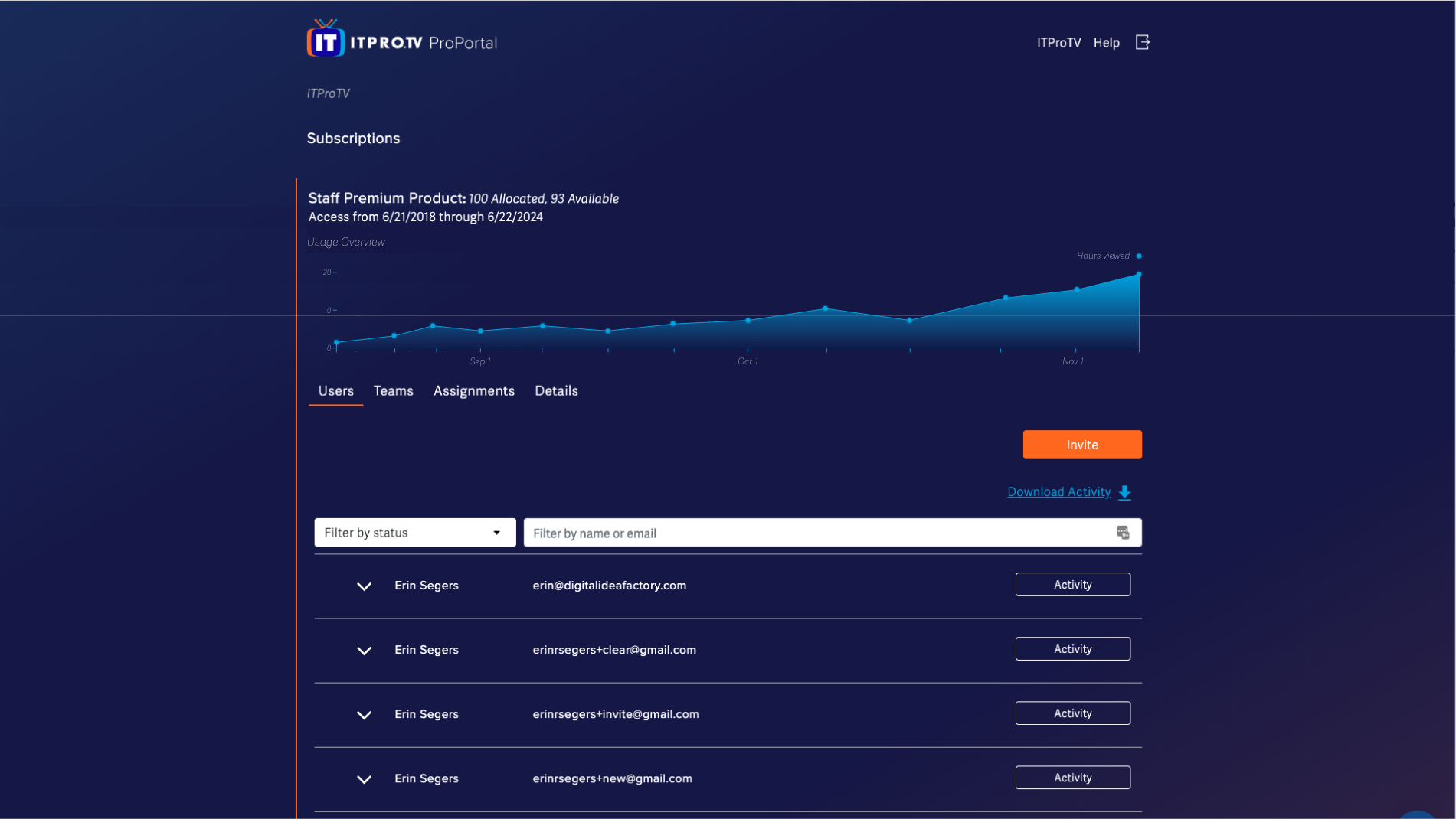
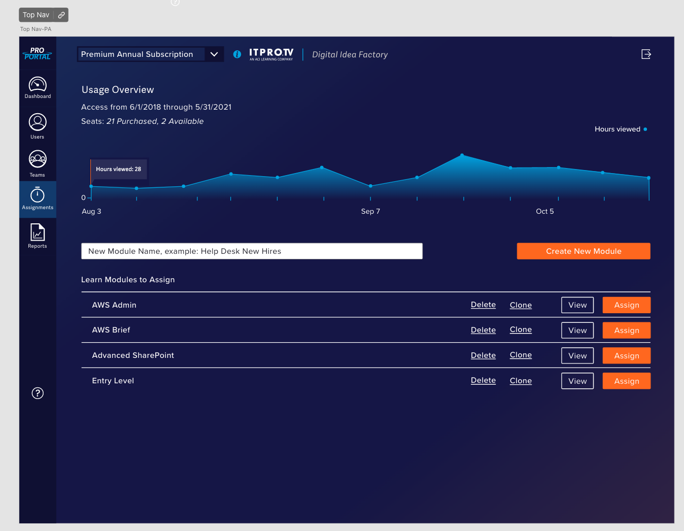
The Dashboard
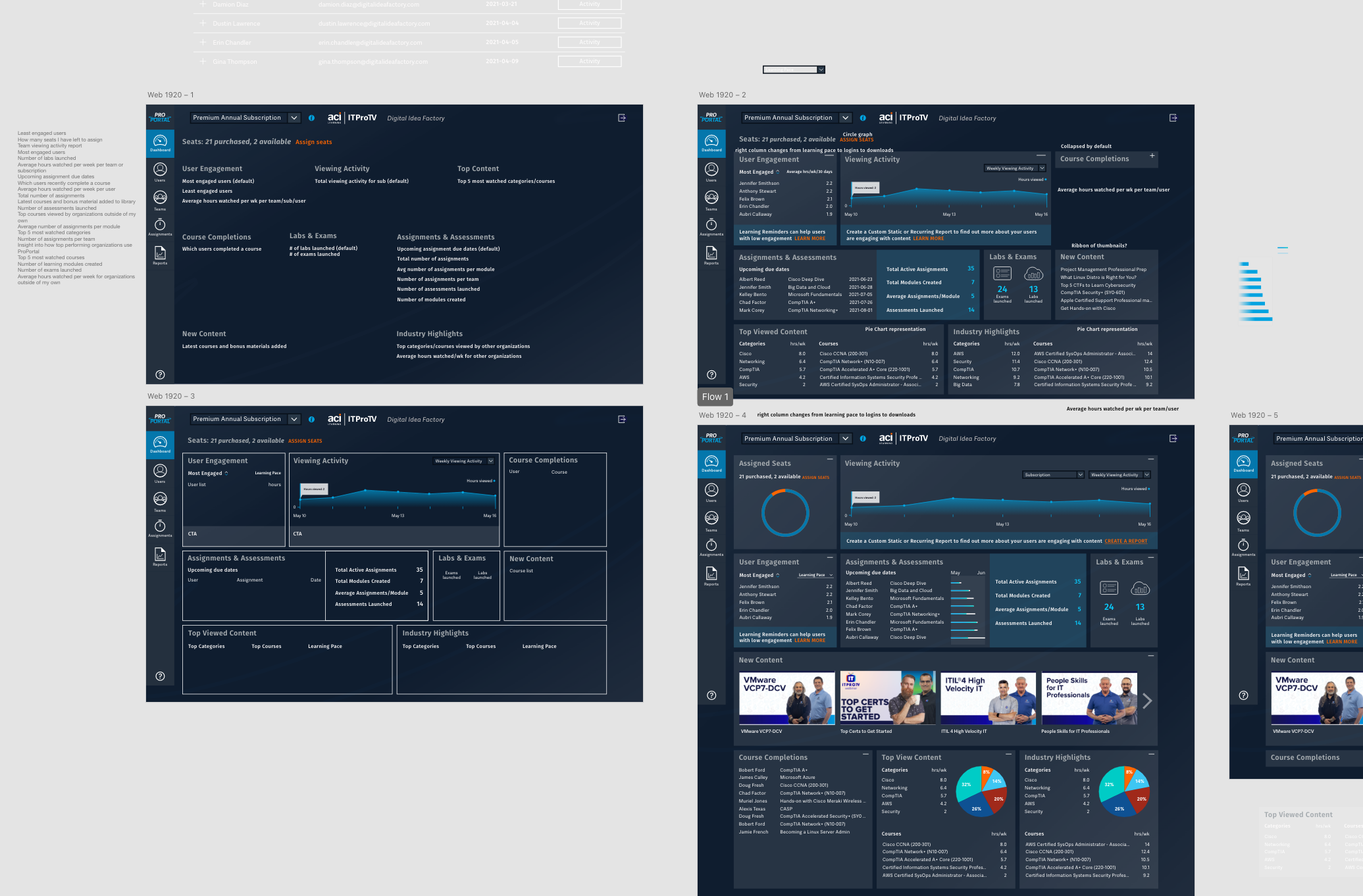
Above are the first three variations of the dashboard design process. You’ll notice the color palette has changed, as the company was acquired in between the implementation of the new nav and the dashboard. Across several meetings, we established the Minimum Viable Product and then what the definition of done would be for this. The dashboard was meant to present “bite-sized” bits of information that could be used as a jumping off point for the rest of the app. First up were text placeholders (top left), then the wireframe with some existing assets (bottom left) and then the first full mockup iteration (top right). The bottom right artboard is the first step to the working prototype.
Closer view at first mockup rendition.
At this stage, we decided the information was not very visual and thus not very “bite-sized”, so we revisited it with the phrase “more visual” in mind. The next idea to implement was rows of widgets that could be dragged around or minimized, depending on the user’s preference.

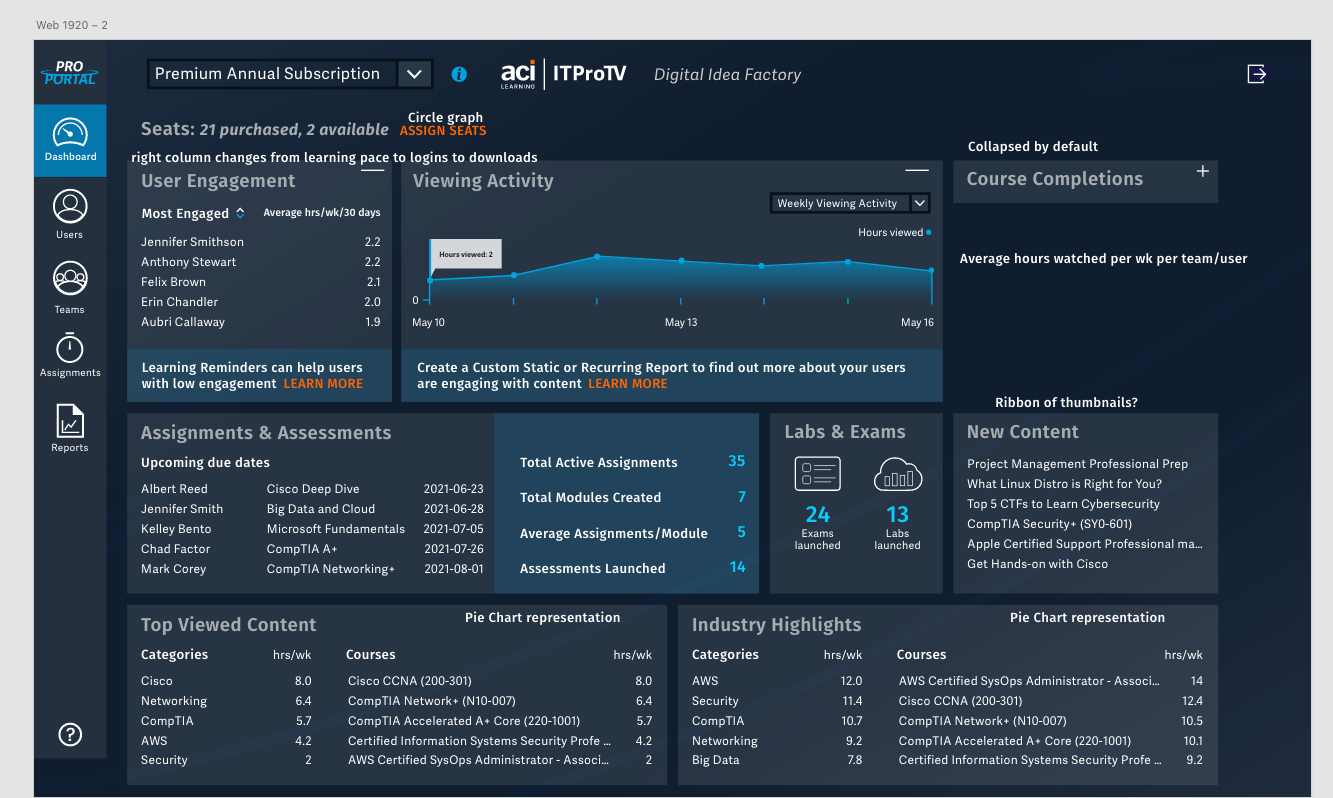
Finally we have the “final” mockup! It was time to wire this up with some other pages for the prototype so that we could user test the dashboard. The test ended up with the user testers being asked to find where on the page they would complete a task. A couple bits of feedback led to us adding titles to the rows of widgets as well as some filter functionalities. It was finally time to move on to development.
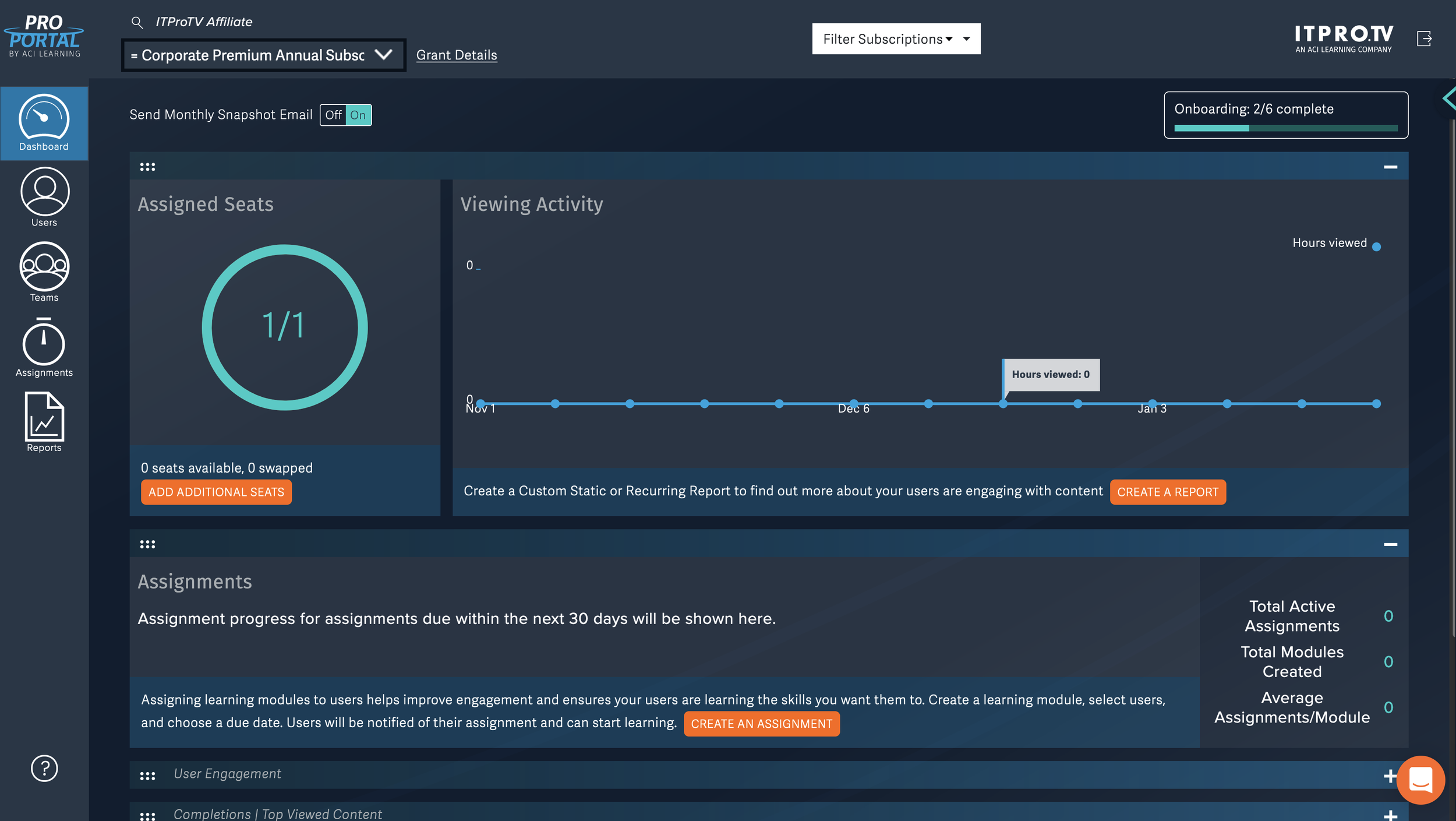
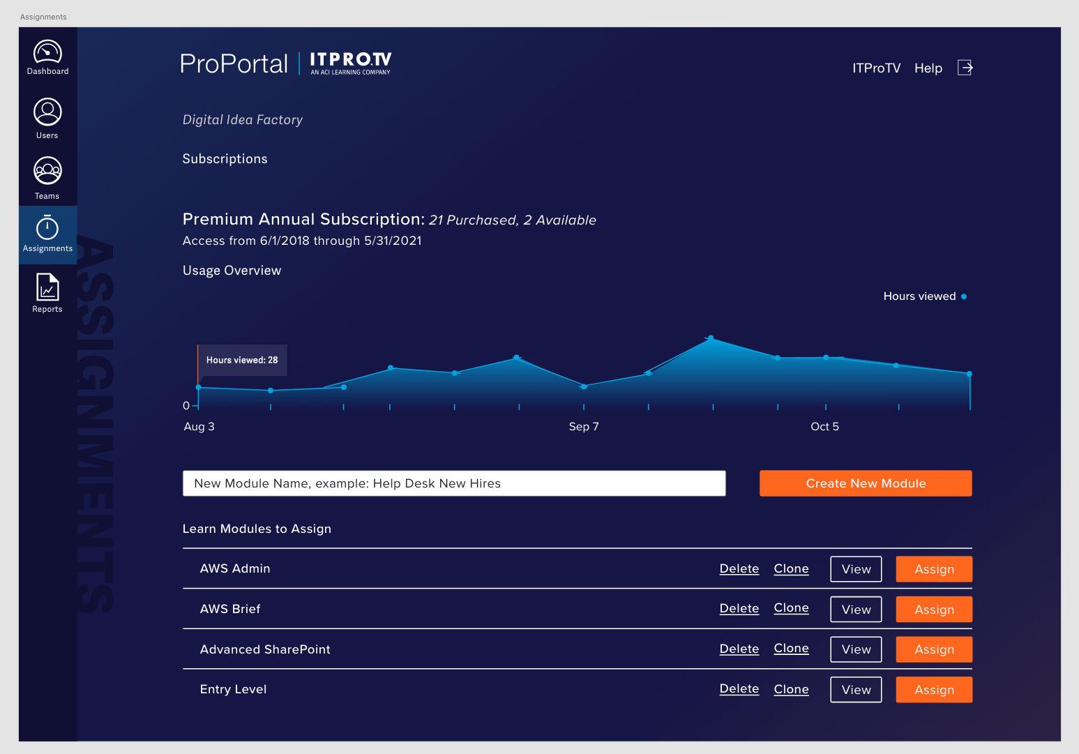
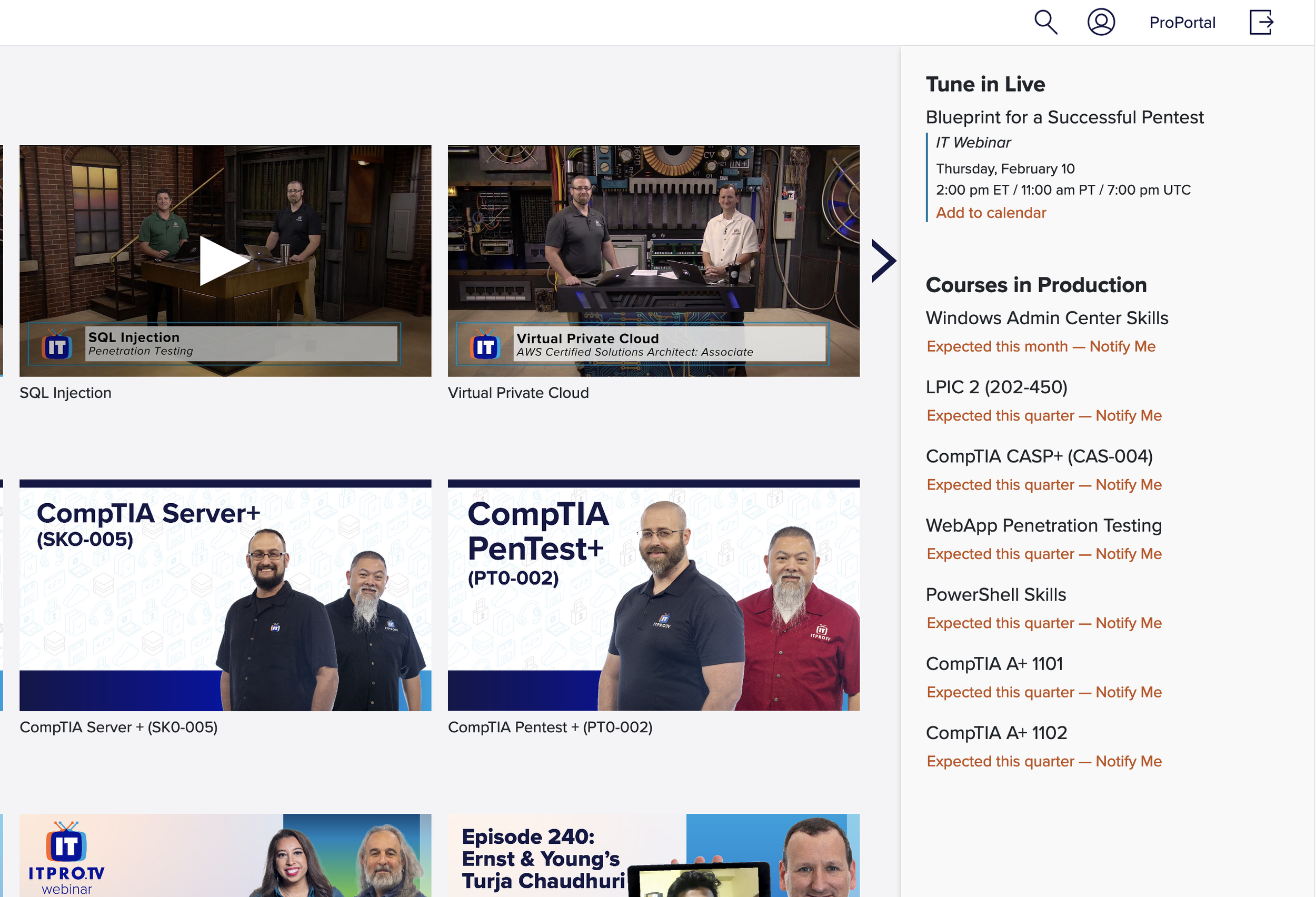
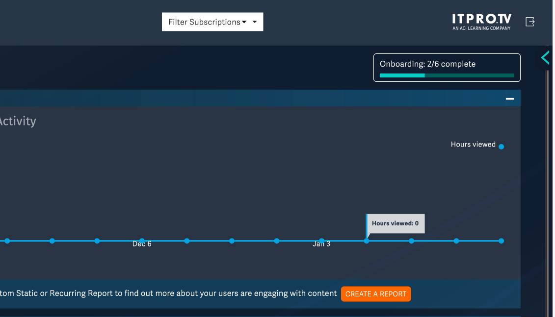
A look at the live site as it stands now.
It took the combined efforts of me and two other front-end developers a couple of weeks to get all of the widgets added, and then another week to tweak the CTAs, styling, and drag-and-drop functionality. This screenshot is more recent than when we first deployed,and by this time we had implemented the Onboarding Panel, the final stage of this project.
The Onboarding Panel
Due to the myriad of accounts versus the availability of Customer Success employees, we needed some way for new accounts to be able to receive onboarding training without having to wait for an open meeting slot with a Customer Success Manager. Thus, the idea of having some sort of onboarding wizard was born. The first steps were to scope out the onboarding steps we wanted in the panel as well as how to present it in a useful, non-intrusive manner.
Luckily we had a UI element that existed in our other product that would be perfect for this: the Notifications Panel, where upcoming events and courses live. This solved the difficult ask of a non-intrusive, pervasive way to experience onboarding.
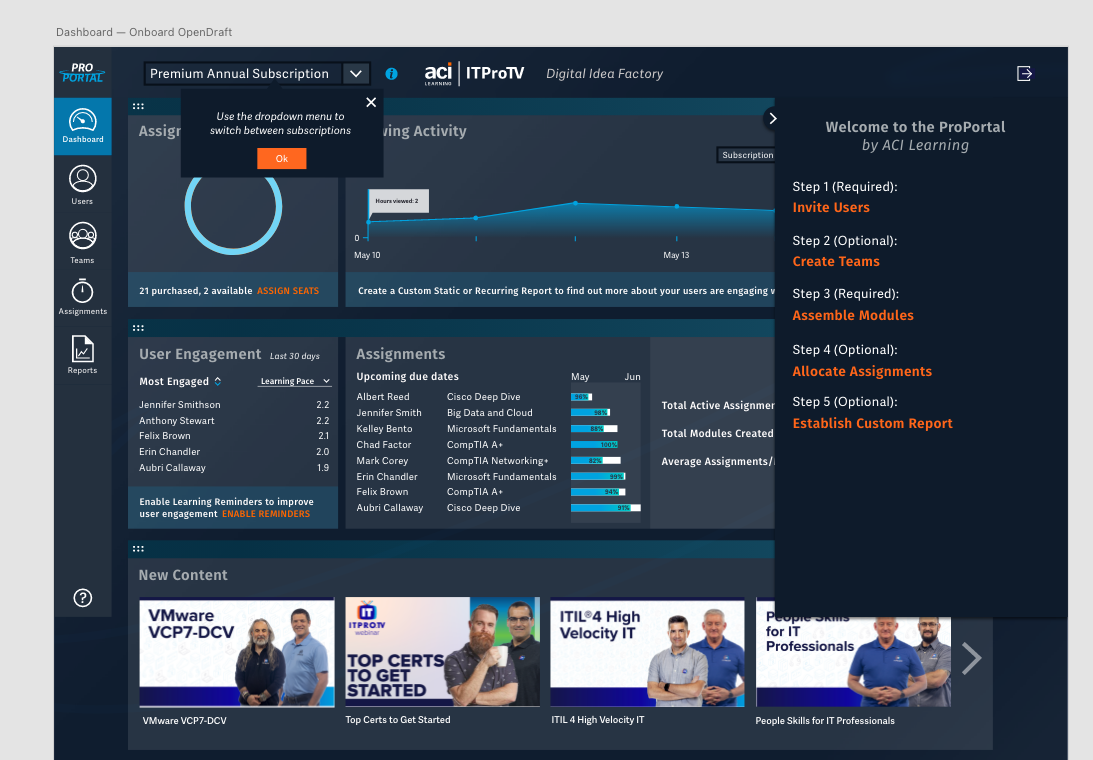
Since we were set on using the notification panel style for this onboarding wizard, we skipped the initial wireframe stage and went straight to the mockup stage. The left-most image was the very first rendition, with all steps open and each link available all at once. Immediately we realized this was a tad bit overwhelming, with no clear direction. In order to solve both of those problems at once, we decided to display just one step at a time with a description of what the app function you were experiencing at the time. We added the ability to skip a step in case a user did not want to complete a step at that time. The final image in the carousel is the artboard layout showing each view of the onboarding panel.

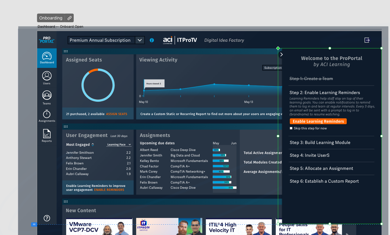
Screenshot of the live onboarding panel. The steps will cross themselves out once complete and identify themselves if they have been skipped.
The final step in the project, inspired by other software dashboards. We thought this button would be helpful to easily access the onboarding panel from the dashboard, as well as giving at-a-glance progress information.
THE CONCLUSION
This project was large, spanned two years, and required many hours of resources. In the end however, the work paid off and we ended up with a ProPortal experience that was light-years ahead of where it started. We have reports from internal and external users praising the new navigation as much more straightforward than before. The Onboarding Panel decreased the average time to complete onboarding from several weeks to a couple days. ProPortal 2.0, as we called it, dramatically increased the value of the app and we hope it will be merely a springboard for further improvements.